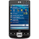
Here’s something going against popular opinion. I would like to put a case forward for NOT having a mobile friendly website. This has come about
from reading yet another article on how small businesses are missing out by not having a mobile friendly website. While it is undisputed that mobile searches are rising, having happy visitors to your site, to either a mobile site or full site when searching on a mobile device, is not mutually exclusive. Many searchers can and will have a good experience on a website that is not specifically designed for a mobile device. But, this comes with a caution, always consider the needs and requirements of your visitors.
A case for not having a mobile friendly website
I have a shoe store ( mainly children’s’) and have set up a mobile website. If searching on a mobile phone, visitors was redirected to my mobile site. As I was unable to have all my (over 500 ) styles of shoes on the mobile site, the site had my location, phone number & address and a tappable link to get back to my ‘full site’.
On studying my google analytics I found that:
- In December 2011 most of my searchers on a mobile device where looking for a particular brand or style of shoe
- They were redirected to my mobile friendly site
- They would then have to click on the link to be taken to the full site to complete the search
- 8.14% of visitors to my site were from mobile devices
- the bounce rate for mobiles was 50%, while non mobile vistors bounced 44%
I turned off the redirection to the mobile site as I felt that searchers were looking for products, not simply my location and/or phone number
Here’s the latest data
- In April 2012 35.63% of visitors on mobile devices, while 39.62% of non mobile visitors bounced
- 13.85% of my traffic is from mobile devices.
While there are many factors to take into account, the above findings have reinforced to me that my visitors are looking for shoes by style, brand etc and need to be able to view the products easily and quickly. Mobile traffic is indeed increasing but my traffic is happier the way my site is now. Though if you do go to my website Foot Forward Shoes there is room for improvement. I need to work on making my address, google map location, phone number and opening hours easier to find ( best practice for websites 101)
Now this is in reference to my retail store, for searchers looking for a local dentist, restaurant, doctor, plumber their needs will differ. They would more than likely require what is considered best practice in mobile sites as described above namely; map, address, phone number etc with tappable buttons suitable for larger fingers (my mobile site)
Conclusion
Before running out setting up or paying for a mobile site for your business, have a good think about searchers are looking for in terms of your business. Do not just accept that a mobile friendly website is a necessity and you are behind the times if you don’t have one. It’s your users that the website is designed for, their needs are paramount.
If you found this post helpful, please click on the sharing buttons below.
To receive our free weekly newsletter with more ideas, articles, information, videos for helping you in your small business sign up on the right.


this is an interesting observation. There must be a way to make a mobile friendly version of your site but not sure how. IT doen’t really make sense if the people want to browse. Unless you want to list the different makes you have without pictures, this seems like a heavy site for mobile so not at all functional.
Thanks Rebecca, yes I think it also depends on how much money you have to spend:)
It was interesting to hear your viewpoint (and experience!) on not having a mobile friendly website! Great points, I appreciate your taking the time to consider others’ needs may differ. Thanks!
Thanks for stopping by Louise, we appreciate your comments and time
Very good insight into making sure you do your due diligence and not just follow trends that are not going to produce results for your company. Thanks!
Thanks Peter for sharing your view
Yeah – finally someone presenting common sense. Not everyone has the same needs in their sites. One size does not fit all. Your case study is well presented and very helpful. Perhaps you could continue this as a series and show when the mobile friendly sites work best and when they don’t for more cases! This post is very helpful to the entrepreneur who faces the cookie cutter ‘you need this’ advice.
Thanks, the fact that I set up the mobile site in the first place is testament to my ‘follow the crowd’ mentality. When I stopped and thought about it I came to a different conclusion.